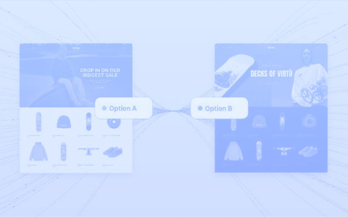
Effective call-to-actions are essential for driving conversion and optimising them can be a low-cost, high-impact initiative. To be effective, call-to-action (CTA) buttons need to be:
- Prominent: make sure they’re not just noticeable but unmissable, draw the customer in. Make sure they appear at the correct point in the user’s journey or make them omnipresent so they will always be in view when required.
- Obvious: make sure there is no room for doubt about what the button actually does and that it is indeed a button. For example, studies show that rounded corners perform better than square as it’s more in line with what users expect a button to look like.
- Clickable: Sounds obvious, but are your CTAs easy to click? Are they large enough for both mobile users with chunky fingers and for desktop users to hit with their mouse?
So, what can you A/B test today?
For the purpose of this article, we’re thinking about Add to Basket/Add to Cart buttons on product pages but most of these still apply to any CTA which you need to optimise for conversion.
1. Colour
So your main brand colour is pale blue and naturally that’s what you’ve chosen for your Add to Basket button. Brand consistency is important, you’ll get no argument from me there, but it must be coupled with good user interface (UI) design. Consider trying a stronger colour which still works well with your palette; maybe a darker shade of blue or even green which has the added benefit of sending the brain a GO message (think traffic lights). Similarly, if your CTA is any shade of red, this could be sending the wrong message, as red is associated with STOP signs and error messages.

2. Size
Buttons are more prominent and easier to hit when they’re bigger. Try adding more height and/or width to the button, possibly increasing the text size by a point or two. When looking at mobile, consider making your CTA stretch the full width of the screen.

3. Wording
It can be tempting to have a bit of fun with button text and inject some of your brand personality, but do so with extreme caution (and a testing plan in place!) In case we haven’t already mentioned it, CTA buttons are crucial for conversion; clarity is an essential part of that. Make sure the button accurately and clearly conveys what will happen when pressed and confirms the customer’s expectations. For example, “Go for it!” may seem like a fun expression of your brand voice but “go for what exactly”? Does it add the product to basket? Does it add to your favourites list? Does it trigger an instant buy process? Uncertainty can cause hesitation or even abandonment so aim for clarity on buttons and save the chatter for other areas.

4. Placement
A few things we know about placement of buttons;
- they perform better when “above the fold” (the area of the page that is in view before scrolling)
- on product pages, they perform better when closer to the images, particularly on mobile.
Look at whether you can either bump buttons up the pecking order or condense the content that sits above.
You could also consider having a “sticky” CTA button which is either permanently fixed to the bottom of the screen, or becomes “stuck” to the top or bottom of the screen once you've scrolled past it.

5. Add to Basket vs Buy Now
This isn’t the same as just changing the wording. These are buttons with different functions;
- Add to cart will add a product to the cart and may trigger the opening of a mini-cart drawer or a modal window to confirm the action has happened.
- Buy Now buttons skip some steps out of the customer journey, such a visiting the basket, and direct them straight to checkout.
Which works best is down to the specifics of your store .Buy Now buttons are ideal for single-product stores and may be more effective for low-priced, quick-decision items as they reduce the time a customer needs to spend to complete their purchase. However, for higher-value products or for sites where you’re looking to increase average order value (AOV), you may wish to allow customers more time to consider and compare items. When you multiply conversion rate change by AOV, do you come out ahead or behind?
You can also trial offering both options with one as a primary CTA and one as a secondary. (We couldn’t recommend offering both with equal prominence as this just gives the customer another decision to make.)

You’re perhaps wondering why your site wasn’t designed with the “right” call-to-action buttons baked in from the outset. But unfortunately, there is no right answer. While there are some CX design decisions that we can make confidently, based on industry best practices and expert knowledge, there are also many instances where the results will vary based on the brand, the product type, the user demographics… plus an ever-changing ecommerce landscape.
So, there’s only one thing to do… TEST IT!


.svg)


